

Intermediate workshop
Nx for Scalable Architecture
Master Nx to enforce architecture, speed up your development workflow and improve code quality
Learn more
While Signal Forms have been highly anticipated by many developers (myself included), the Angular Aria package is by far my favorite feature in Angular 21.
The most difficult part of starting with accessibility is learning how to implement it. Angular Aria is removing that entry barrier by providing amazing directives. That does not mean that you don't have to learn anything about A11Y now or in the future ;)
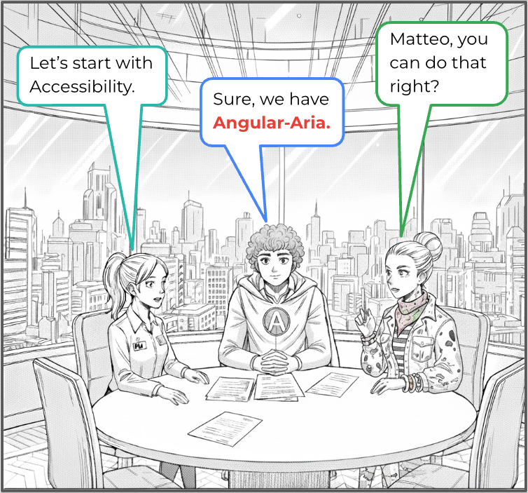
As some of you may know, I consider myself a bookworm and comic addict, and because of that, I’ve always wanted to create a Comic book on my own, but was lacking drawing skills. With the evolution of AI - Nano Banana, I can finally do it! I’m also a big fan of learning by doing, and that is exactly what we will do today. We will create a simplified cinema application using every piece of the library. Now, let me introduce you to our Comic Book Heroes!
Starting with accessibility reduces technical debt, but its real value goes beyond that. An accessibility-first approach fundamentally changes how you think about the user journey. When accessibility is considered from the beginning, you’re forced to design for a wider range of users. This often leads to clearer information hierarchy, more intentional interaction patterns, and simpler flows overall. Instead of optimizing for a “default” user and adjusting later, accessibility pushes you to build inclusive experiences by design. There’s also a strong practical advantage. Applying accessibility after features are fully implemented is significantly harder. At that point, accessibility issues often expose deeper structural problems semantic markup, focus order, and component composition that require large refactors. Addressing these concerns early allows accessibility requirements to shape the structure itself, rather than fighting against it later. In that sense, accessibility-first isn’t just a best practice - it’s a way to build better foundations from the start, both for users and for the codebase.
git clone https://github.com/AdrianRomanski/angular-aria-cinema
cd angular-aria-cinema
Check out the starting point:
git checkout part-1-start
yarn install
“Note on color-coding.”
Before we start, I will introduce you to the color legend.
This approach will make the main parts stand out while still keeping the big picture clear.
libs/reservation/feature-movie-selection/src/lib/ui-day-selection.ts
import { Combobox } from '@angular/aria/combobox';
libs/reservation/feature-movie-selection/src/lib/ui-day-selection.html
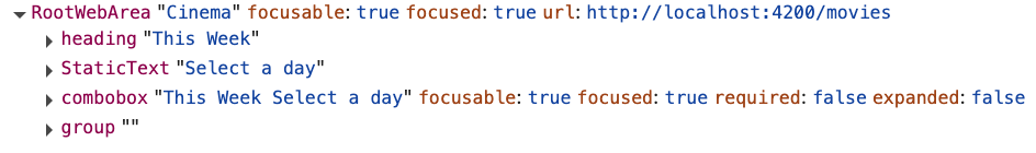
This Week
libs/reservation/feature-movie-selection/src/lib/ui-day-selection.html
This Week
For more information, see Combobox Role.
Manages open/close state, keyboard interaction, and ARIA roles.
Prevents free text input - selection must come from options.


With our container ready, let’s add an input block.
import {
  Combobox,
  ComboboxInput
} from '@angular/aria/combobox';
We need to add more functionality:
A display for the selected day or placeholder message using the day() method
An input element for date selection
An arrow icon to indicate the open/closed state
       {{ day() }}

       ▼
       {{ day() }}

       ▼
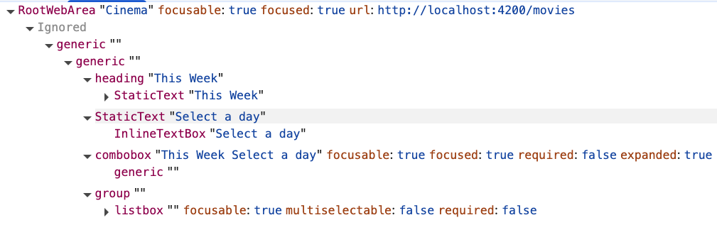
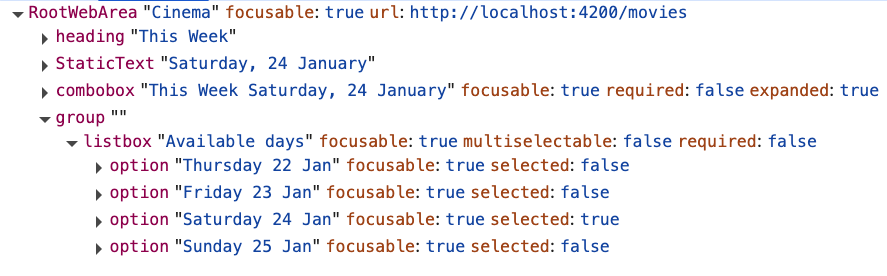
Let’s check the accessibility tree.
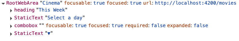
We need to fix two problems:
This Week
{{ day() }}
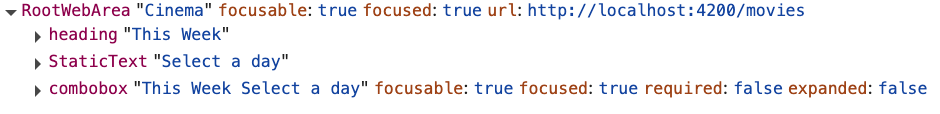
Cool! The icon is no longer visible in the tree, and combobox has meaningful labels.
Associates the input with human-readable text from the heading and selected value.
For more information, see aria-labelledby.
Hides the decorative icon (▼) from assistive technologies since it’s purely visual.
For more information, see aria-hidden.
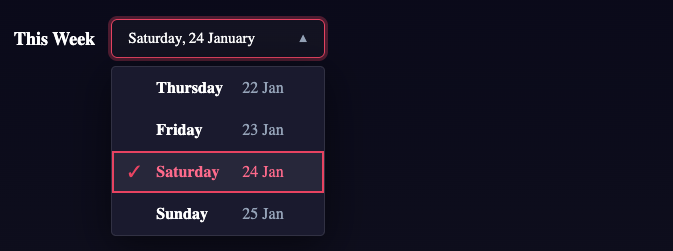
Closed State


Focused State

Visual: A proper focus indicator is visible Tree: focused is set to true, expanded is set to false (closed)
Open State
Visual: An arrow is rotated
Tree: expanded is set to true (open)
After the user interacts with the input, we want to show the list of days. To achieve this, we'll connect a template that holds the list to a trigger using a combination of Angular Aria and Angular CDK.
import {
  Combobox,
  ComboboxInput,
  ComboboxPopupContainer
} from '@angular/aria/combobox';
import { CdkConnectedOverlay } from '@angular/cdk/overlay';
Marks where the combobox popup content is defined.
Ensures correct ARIA relationships between trigger and popup.
For more information, see overlay.
Group has been added to the tree, it represents the overlay where the list will be displayed. It will be displayed after interaction with the element (clicking it or focusing it), as it’s lazy-loaded.
The last piece of this component is actually the template we want to show.
It will hold a List of day Options for the current week.
import {
  Combobox,
  ComboboxInput,
  ComboboxPopupContainer
} from '@angular/aria/combobox';
import { Listbox, Option } from '@angular/aria/listbox';
import { CdkConnectedOverlay } from '@angular/cdk/overlay';
Why an ordered list? Because the order of days matters, we don’t want to start a new week on Friday… or do we? 😄
@for (day of days(); track day.value) {
There are 3 things we want to display: the selected state, the name of the day, and the date itself.
@for (day of days(); track day.value) {
Defines an ARIA listbox.
For more information, see listbox role.
Manages option selection, focus, and keyboard navigation.
Enables two-way binding for the selected option.
Registers this element as a selectable option inside the listbox and applies ARIA role="option".
For more information, see option role.
The value emitted when this option is selected.
An accessible label used by screen readers
Open List of Days
Select a Day
This Week
{{ day() }}
@for (day of days(); track day.value) {
If we really want to be sure that our solution is working, we need to get our hands dirty 😀 Screen Reader testing is not that hard if you do it step by step. First, we need to turn on the software. But before we jump in, here’s another color legend 😂
Turn on the Voiceover
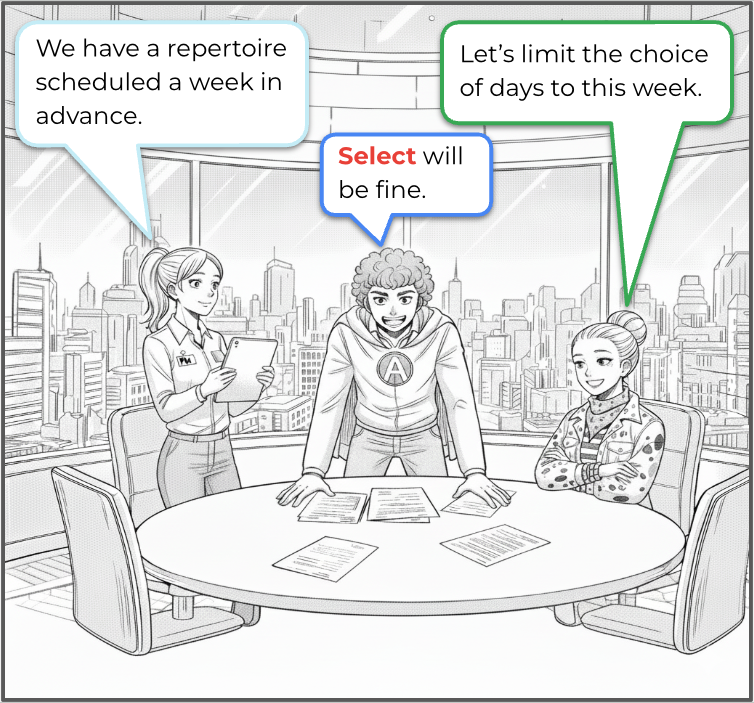
Our trainee is joining the room:
Software Engineer - Matteo Rossi
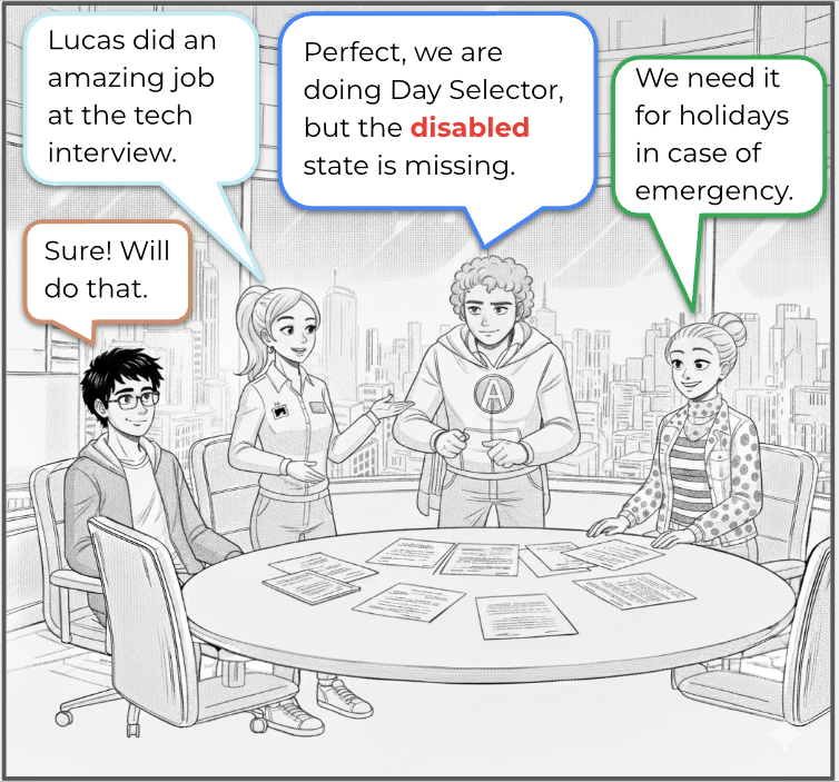
Add a disabled state using the option-directive
Add a story that features one or more holidays
git checkout part-1-finish
If you enjoyed this article, I’m happy to share that we will be creating a new component every second Monday. If you’re reading this in the future, just jump into the next lesson! 😀
Intermediate workshop
Master Nx to enforce architecture, speed up your development workflow and improve code quality
Learn more
Implement incremental hydration in a real-world Angular app - Basic setup, hydration triggers and important considerations for a seamless integration.

Let's dive deeper into why incremental hydration in Angular matters so much for performance and user experience, focusing on its influence on Largest Contentful Paint (LCP), Interaction to Next Paint (INP), and Cumulative Layout Shift (CLS).
Incremental hydration is a groundbreaking new feature in Angular that heavily impacts critical performance metrics like INP and LCP, while also reducing the effort required to maintain CLS at low levels.

PushBased's 2024 recap: 43 talks, NgGlühwein conference, RxAngular updates, and more. A year of growth, innovation, and community! Read our journey. 🚀
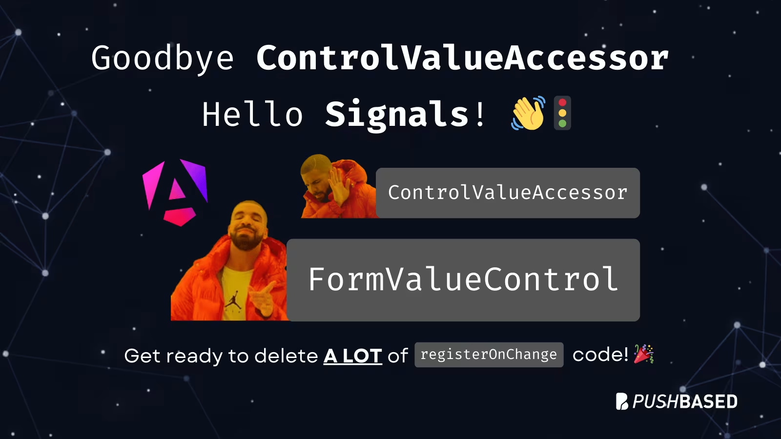
Angular is bridging the gap between the new Signal-Forms architecture and the Template/Reactive Forms. This isn't just a minor update—it’s a fundamental shift in how we author custom form controls.

Profiling is easiest when it's real. Learn how to capture and make sense of CPU profiles in Node.js across scripts, threads, and processes—then apply it to your own projects.