Welcome back to our continuing exploration into design tokens, and their place within modern development flows. Picking up from where we left off, this segment puts Figma under the microscope. Specifically, we’re shining a spotlight on the magic Figma’s ‘variables’ feature brings to the table, despite being in its beta phase.
The Lure of Figma’s Variables
While the ‘variables’ feature of Figma is currently in beta, it already showcases boundless potential. But before we deep dive, it’s crucial to understand the bedrock of any design system: its hierarchical layers.
The Three Pillars of a Design System
A holistic design system usually rests upon three foundational pillars:
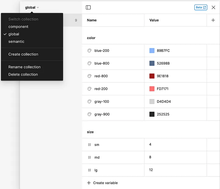
Global Tokens: Think of these as the basics. For instance, the HEX value of a color.
Semantic Tokens: They impart meaning within the design framework. A primary color, for example, can be termed as a semantic token.
Component Tokens: These are the detailed styling parameters specific to a component, such as the background color of a button.
A snapshot from Figma highlighting the ‘Global Variable Collection’. The view displays the various variables within this collection. A dropdown menu is also present, illustrating the structured hierarchy of the three design pillars within the platform.
Strategizing Organization in Figma: Variable Collections and Files
As we delve into the intricacies of design systems within Figma, it’s crucial to understand how we can best structure these three layers for optimal workflow:
Multi-layered Variable Collections in a Single File: For a unified perspective, designers can create different variable collections for each of these layers within one file. This approach allows for a cohesive view of all tokens while maintaining their distinct categorizations. This is especially useful when the design layers are closely knit and need frequent cross-referencing.
Dedicated Files for Distinct Design Layers: By segregating each layer into its own file, each layer gets its dedicated focus, which is particularly beneficial when different teams handle distinct layers. This method also offers better control over the library publishing process. Design teams can ensure that new styles or updates are only made available to the next design tier once an update to the library has been released, ensuring a controlled rollout of design changes.
Brand-specific Files for Global Tokens: Organizations that manage multiple brand identities might find it advantageous to maintain separate files for each brand’s global tokens. This dedicated approach ensures that the unique nuances of each brand remain uncompromised while still nestling within the broader design system framework. Notably, these brand-specific files also benefit from the controlled library publishing process, making sure that brand integrity is maintained at each design update phase.
The organization within Figma is versatile, and the approach you choose can greatly influence the efficiency and clarity of the design process. Whether you’re consolidating everything within a single file or spreading it out over multiple files, the key is to maintain a structure that resonates with the team’s workflow and the project’s requirements.
Juggling Themes: From Daylight to Midnight and Festive Times
Themes are integral to user interfaces today. While the default remains the binary choice between light and dark, Figma’s most expensive licensing allows for up to 40 distinct modes. This flexibility enables designers to draft unique themes for special occasions or distinct brand personas.
Theming is predominantly applied at the semantic level. Here, depending on the theme, different primary colors or other design tokens are assigned. Starting at the global level, designers define all potential tokens — colors, sizes, and other attributes that may feature across different themes. Once these global tokens are established, the semantic layer’s role is to match these tokens from the global layer to their respective themes.
To provide an illustrative example: if you’re acquainted with Material Design, this process might remind you of how the primary color for light mode is represented as “your-color-40” and for dark mode, it’s “your-color-80”. This distinction and assignment are efficiently managed in Figma, ensuring that creating or toggling between modes remains a straightforward task.
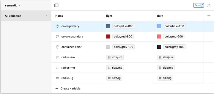
A screenshot from Figma showcasing the ‘Semantic Layer’. The visual contrasts between the ‘Light’ and ‘Dark’ modes are prominently displayed, demonstrating the flexibility of theme application.
Delving into Component Details
When we talk about components, there’s an intricate web of decisions that lies behind each design choice. Take a seemingly simple component like a button. Beyond its basic look, there’s a myriad of factors to consider:
Basic Styling: This includes attributes like border-radius, background color, text color, spacings, and borders.
States: Every component has different states it can exist in. For a button, these could be hover, pressed, active, and disabled, to name a few.
Variants: Components often come in multiple styles. Buttons, for instance, might have primary, secondary, or link-like variants indicating main actions or alternative ones such as cancel. Further complexity arises when we consider that these variants themselves might differ in style. Some buttons might be filled with a solid color, while others may just be outlined.
Organizational Approaches:
The overall design system’s structure often dictates how components are organized. Here are a few strategies:
Using Modes: If your design system has multiple stylings for a component, Figma’s modes can be invaluable. For instance, creating an ‘outline’ and a ‘filled’ mode can group these styles, making it easy to switch between them without re-applying all the underlying variables.
Grouping Variables: In scenarios where there’s a clear distinction, like a primary filled button versus a secondary outlined one, it might be more efficient to group variables within Figma. Additionally, Figma’s “Variants” feature offers an alternative to switching between variable modes, allowing for a seamless transition between different button styles.
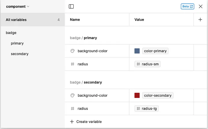
A screenshot from Figma displaying the Component Level. The focus is on the ‘Grouping Variables’ approach, where related design variables are neatly categorized under specific component sections.
Through such systematic layering and grouping, Figma offers a structured yet flexible approach to manage the complexities of component styling.
Unlocking the Potential of Variable Groups and Naming in Figma
In Figma, structuring variable names with groups is more than just an organizational tool — it’s a feature that amplifies the designer’s intent. Instead of tediously prefixing every variable with terms like “color/”, Figma provides an elegant solution. By creating a group named “color”, the platform automatically gathers variables under that umbrella and prefixes each variable internally with “color/”. This seemingly simple feature becomes incredibly powerful as these groups can also be nested, allowing a hierarchical organization of variables that share a common theme.
However, the power of variable groups doesn’t stop at mere organization. They offer an additional layer of semantics, enabling designers to infuse more context and meaning into the structure. This becomes especially crucial when considering an end-to-end workflow, where design themes from Figma are automatically extracted and synchronized with your web components. To elucidate the end-to-end workflow, consider a designer working on an e-commerce platform. When they adjust a primary color in Figma to suit a festive theme, this change can be automatically mirrored in the web component used site-wide, ensuring a consistent look without manual intervention. Although the intricacies of this synchronization process will be discussed in an upcoming blog post, it’s worth noting how variable groups can play a pivotal role.
For instance, at the component level, the initial group can specifically denote the component type. However, it’s crucial to note that this approach mainly benefits situations where modes aren’t being used at the component level. In scenarios where modes are employed, having separate collections for each component can be more logical, as modes are shared across groups. By leveraging this structure, designers can employ the same variable names across different groups, which correspond to identical CSS variable names. This strategy facilitates overriding specific component properties based on the chosen variant or theme. In essence, variable groups in Figma become a potent tool in bridging the gap between design and development, ensuring both spheres are always in harmony.
What Awaits Us in Figma’s Future?
Figma’s recent conference has set the design community abuzz with anticipated upgrades. Here’s a brief overview of the forthcoming features we’re eager to see integrated:
Deep Dive: unlock design system scalability with variables - Luis Ouriach, Jacob Miller(Config 2023)
Elevated Variable Support: Figma is expanding its support for variables across the board.
Enhanced Collection Differentiation: The platform is gearing up to provide clearer separations between modes, especially when differentiating between themes and brands. This promises to refine semantic distinctions at each mode level.
Embracing Text Styles as Variables: Soon, designers can look forward to defining text attributes like font and line-height as variables, enhancing design consistency and scalability.
These anticipated enhancements in Figma hold special significance for developers. The broader variable support, for instance, facilitates a more dynamic link between design tokens and their coded counterparts. By offering more explicit collection differentiation, it becomes straightforward to ensure that brand-aligned themes are consistently mirrored in the development environment. And with the incorporation of text styles as variables, developers can more readily maintain uniform design aesthetics without additional overhead. All these changes, when combined, set the stage for a tighter, more harmonious integration between design and code.
These updates aren’t just about new features; they’re about smoothing the design-to-development pipeline. With these enhancements in place, achieving an automated end-to-end workflow to keep design and component libraries synchronized will be a breeze.
Stay tuned for our post in this series, where we’ll delve deeper into the synchronization process between Figma and component libraries, revealing insights to optimize your design-to-code journey even further.
Part 2 of 4 in our Mastering the Design-to-Code Flow with Figma, Storybook, and Angular series
Learn how to effectively use variables and design tokens in Figma, and apply them to style components. Master the creation of components in Storybook to build cohesive design systems.