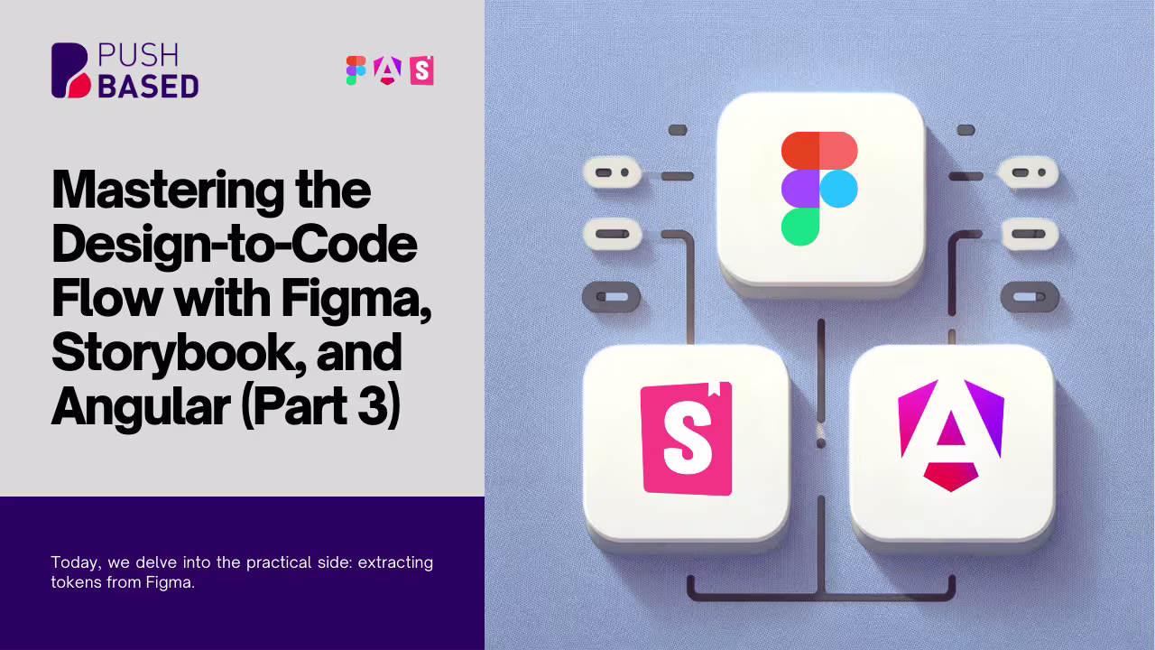
Welcome to the our series, where we’ll explore the synergistic relationship between Figma, Storybook, and Angular, shedding light on the modern-day workflows of designers and developers. As technology continues to evolve, so do the tools and techniques we use, and this series aims to provide a deep dive into the most promising practices. This first part delves into the world of Design Tokens.

Photo by Balázs Kétyi on Unsplash
The Rise of Design Tokens
Before the dawn of design tokens, style guides reigned supreme. Handcrafted and maintained with dedication, these guides were the compass for designers and developers alike. But with rapid technological surge came Design Tokens — the dynamic descendants of style guides, offering versatility and precision.
A Glimpse into Design Tokens
Design tokens can be envisioned as atomic snippets of UI, representing properties like colors, fonts, spacings, or shadows. These aren’t hardcoded static values like HEX colors or pixel sizes; they’re named entities. Think of them as variables in programming, containing a name (key) and value (an alias or a static value). One finds them sometimes structured in a JSON format that might look something like this:
{
  "baseColors": {
    "red": "#FF5733",
    "blue": "#3333FF",
    "white": "#FFFFFF",
    "grey": "#D0D0D0"
  },

  "colors": {
    "brand": {
      "primary": "{baseColors.red}",
      "secondary": "{baseColors.blue}"
    },
    "background": {
      "default": "{baseColors.white}",
      "highlight": "{baseColors.grey}"
    }
  }
}
Why Use Design Tokens?
Single source of truth: Manage design decisions from one place.
Simplified Maintenance: Update once, see changes everywhere.
Consistency: Maintain a unified design across platforms.
Collaborative Harmony: Bridge the gap between design and development.
Scalability: Adapt easily as projects expand.
Automation: Streamline development with auto-generated stylesheets.
But note: The path of design tokens isn’t without its hurdles. Aligning a team, setting up the system, and ensuring flexibility to foster creativity requires careful strategizing.
Design Tokens Unveiled: A Comparative Dive
The beauty of design tokens lies not just in their capacity to encapsulate design decisions, but in their flexibility and how different design systems apply them. Peeking into the strategies of tech giants like Google’s Material Design and Adobe Spectrum provides a panoramic view of design token implementation.
Material Design
Material Design uses a structured three-level hierarchy: reference, system, and component tokens. Each level plays a specific role in assigning and translating design decisions across themes or components.
Reference Tokens:
These are foundational decisions, specifying primary colors, typography and more.
Example:
System Tokens:
Derive values from reference tokens, accommodating various themes (light/dark).
Example:
Component Tokens:
Apply system tokens to specific UI components.
Example:
Naming Convention:
Begins with the “Material Design” prefix, followed by the token’s category, purpose, and other attributes.
Adobe Spectrum
Adobe Spectrum has a dual approach: component-specific tokens and global tokens. These are then further categorized by their purpose: sizing, color, and layout.
Sizing Tokens:
Use a t-shirt size categorization (small, medium, large, etc.) as token conventions. Certain components use numerical scales instead (50, 100, 200, etc.).
Color Tokens:
They differentiate between global tokens, which define colors across themes, and alias tokens that specify component-specific uses.
Example:
Layout Tokens:
Address foundational design elements like borders, spacing, etc.
Example:
corner-radius-100
border-width-100
Naming Convention:
A human-readable, flat structure with three potential parts: Context, Common Unit, and Clarification. This allows for predictability and flexibility.
Common Grounds
On a granular level, each design system exhibits unique attributes, but at a higher abstraction, they share foundational similarities:
Token Grouping: Both Material Design and Adobe Spectrum group tokens by purpose, though they use different terminologies (e.g., palette, typeface versus sizing, color, layout).
Hierarchical Differences: Material Design distinctly separates reference and system tokens, while Adobe Spectrum combines these levels into global tokens.
Naming Conventions: Material Design’s naming leans towards a hierarchical and categorized approach, while Adobe opts for a flatter, more direct naming style.
Though these systems appear different superficially, their core intent remains consistent — abstracting design details into reusable and maintainable tokens.
Crafting Your Design Token System
Stepping into the world of design tokens requires meticulous planning and a clear vision. Consider the following points on your roadmap:
Collaborative Workshops: Foster understanding via group sessions.
Start Small: Begin with basic properties and expand over time.
Documentation: Keep a comprehensive record of your tokens.
Version Control: Track the evolution of your design tokens.
Feedback Loop: Encourage discussions between designers and developers.
Prototype and Test: Validate on different platforms.
Modular Approach: Make tokens reusable.
Consistent Naming: Keep it intuitive and descriptive.
Automate Where Possible: Use tools to convert tokens into code.
Diving Deeper into Design Tokens
For those who are keen to delve further into the nuances of design tokens, I recommend exploring the comprehensive guide by Nathan Curtis on Medium. Their deep-dive into the subject provides valuable insights, practical tips, and real-world examples that can further enhance your understanding and application of design tokens.
Stay tuned for the next part of our series, where we’ll delve deeper into how Figma, Storybook, and Angular streamline the design-to-code workflow. Trust us; design tokens are merely the beginning!